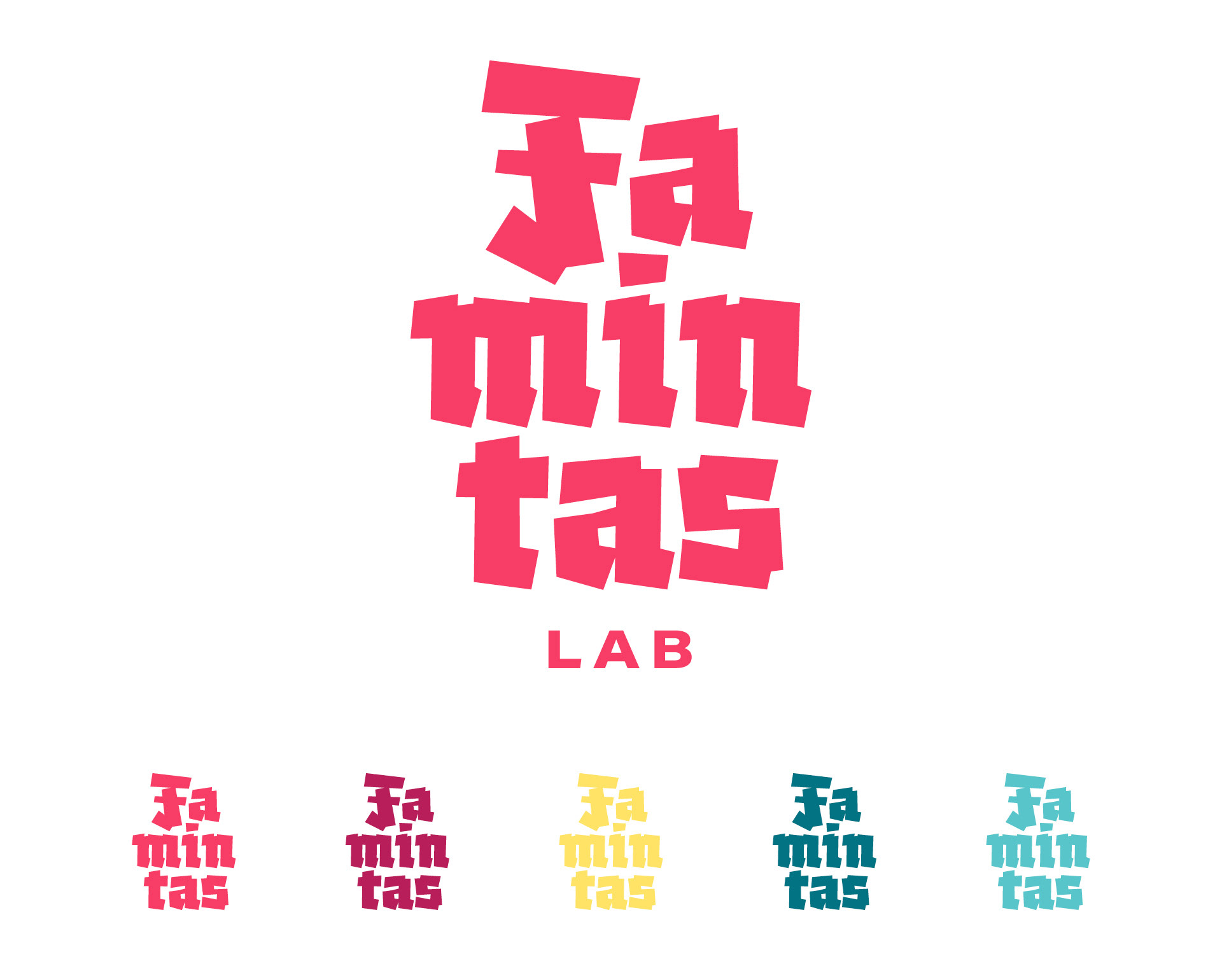

Lettering designed for a cultural center logotype.
Conceptually the word "famintas" (something like "hungry", in feminine and plural) asked
for bolder letterforms, and the blackletter reference came from a subtle reference to the older
brand's logotype, related with graffiti and "pixo" - originated from the use of gothic
type references for painting walls and cities.
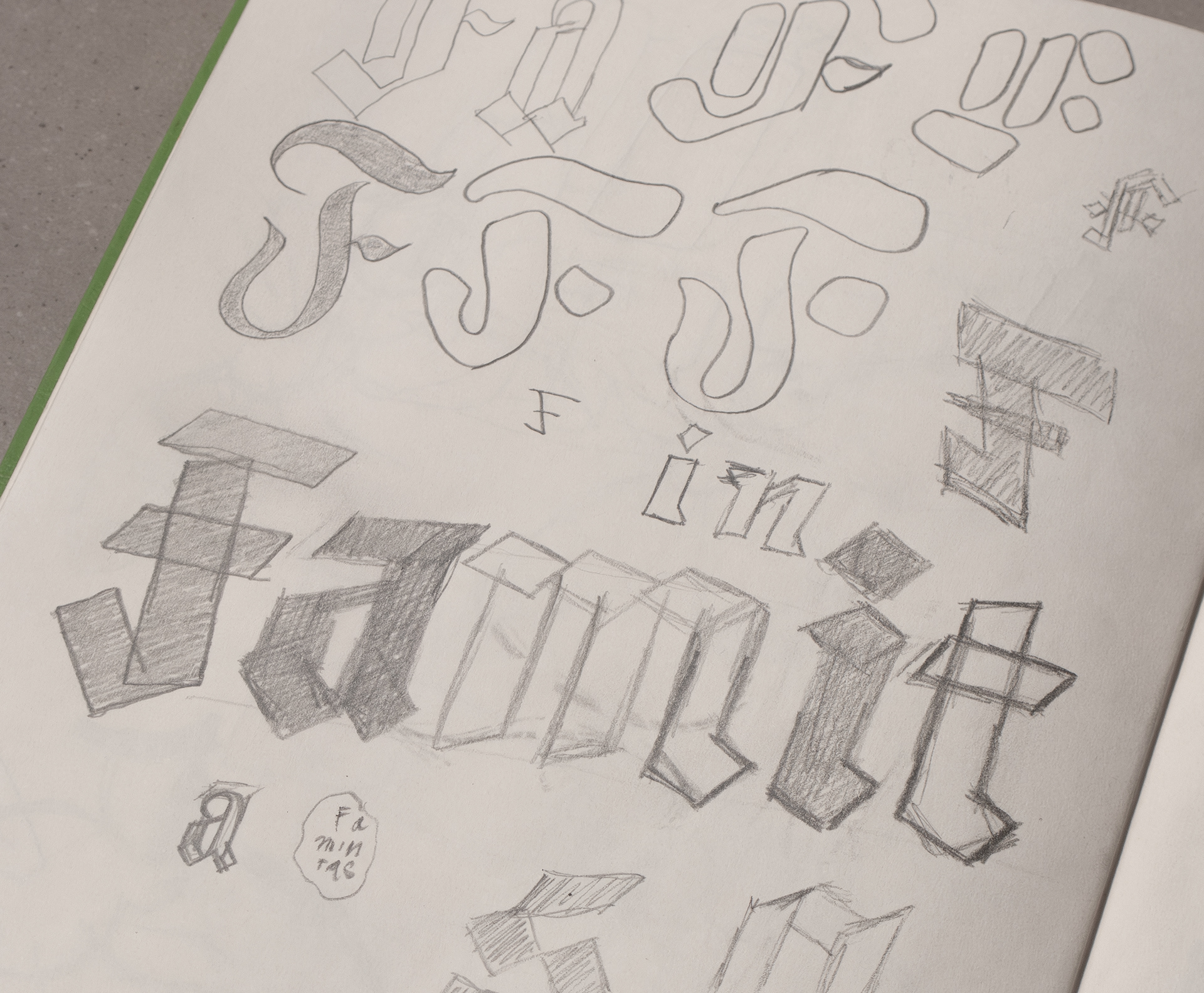
Sketch